outline is your friend
posted on
If you open a plain HTML document with no CSS and you focus an interactive element like a button, link, or textarea, you’ll see that by default browsers use the outline property to highlight these elements.

outline is great
The outline property is the perfect candidate for this job for several reasons.
-
outline doesn’t break layout.
Unlike the
borderproperty (ifbox-sizingis not set toborder-box),outlinedoesn’t add to the width and height of an element. It just creates an outline without taking up any space. -
You can add spacing between the content and the outline using
outline-offset.
Outlines on Stephanie Eckles website have some extra spacing. -
You can customize the width, style, and color.
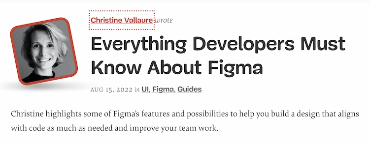
Big, red, dotted outline around a link in a teaser on smashingmagazine.com :focus { outline-width: 3px; outline-style: dotted; outline-color: #d33a2c; outline-offset: 2px; } -
outlineworks great in forced color modes like Windows High Contrast Mode (WHCM)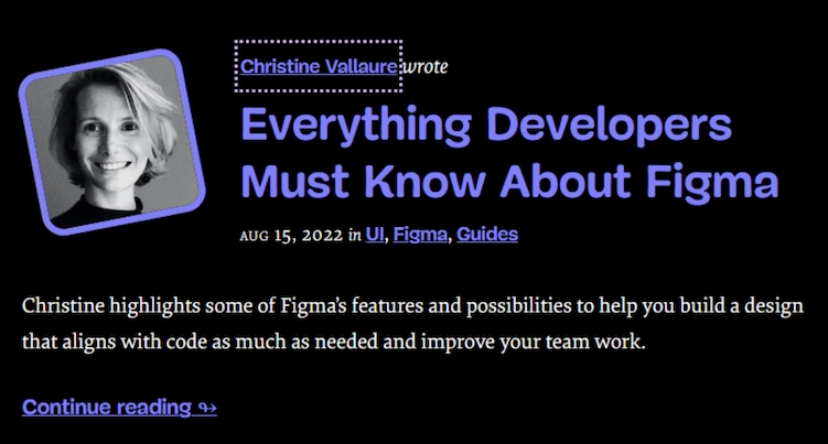
The same outline with different colors in a dark Windows theme.
outline sucks
There are also disadvantages to using outline.
-
Outlines don’t look nice.
Yes, outlines don’t necessarily look great, but 1. Oh my god, who cares? It doesn’t have to look nice, it just has to work well for your users and 2. you can tweak them to a certain degree and make them work with your design (see smashingmagazine.com).
-
The default outline might not be visible enough.
I advice against leaving the default focus styles untouched because they might not work with every design. Overwrite them with something that works better with your theme.
  /* Removes the default outline only in browsers that support :focus-visible */
  :focus:not(:focus-visible) {
    outline: none;
  }

  :focus-visible {
    outline: 2px dashed #282828;
    outline-offset: 2px;
  }
What about other properties?
If you remember, one of the advantages of outline is that it works great in forced color mode. If this property works well, it means that there must be properties that don’t work well.
Here’s an example. Instead of using outline, I change the background and add a box-shadow on focus-visible.
:focus:not(:focus-visible) {
  outline: none;
}

:focus-visible {
  outline: none;
  background: #000;
  color: #fff;
  box-shadow: 0 2px 0 0 #fff, 0 5px 0 0 #000;
}
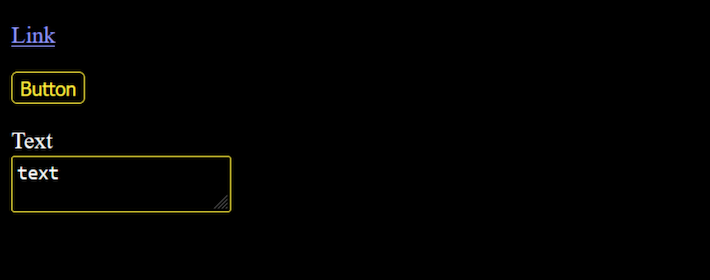
This is how focus styles on the button look like with regular contrast settings.

And here’s the same focused button in WHCM. We don’t see anything because these properties are reverted in forced color modes.
Transparent outlines
Now you might be thinking “But…but a11yproject.com and gov.uk are using background colors for some of their focus styles”. Yes, they are using background-color, but they’re doing it in combination with outline. This is a nice trick to avoid visible outlines in normal color mode and assure that they’re displayed in forced color mode.
.c-homepage-card__cta:focus {
  background-color: #fb37ff;
  color: #000;
  outline: 3px solid #fb37ff;
}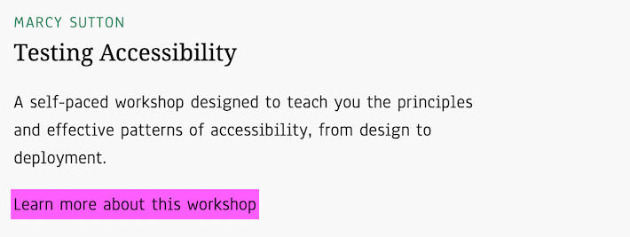
a11yproject.com uses the same color for the outline as for the background.
.govuk-link:focus {
  outline: 3px solid transparent;
  color: #0b0c0c;
  background-color: #fd0;
  box-shadow: 0 -2px #fd0,0 4px #0b0c0c;
  text-decoration: none;
}
gov.uk uses a background color and box-shadow in combination with a transparent outline

No background color and box shadow in WHCM.
Conclusion
Be careful when customizing focus styles, don’t forget to test in forced color modes, and always remember that outline is your friend.