Day 103: the prefers-reduced-transparency media feature
posted on
It’s time to get me up to speed with modern CSS. There’s so much new in CSS that I know too little about. To change that I’ve started #100DaysOfMoreOrLessModernCSS. Why more or less modern CSS? Because some topics will be about cutting-edge features, while other stuff has been around for quite a while already, but I just have little to no experience with it.
Design trends like Glassmorphism use translucent backgrounds to create a specific visual effect, resulting in underlying background colors or elements shimmering through the background of the overlaying element. That may be visually appealing, but it can distract some people and impair legibility.
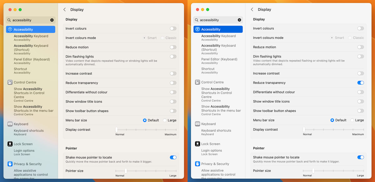
Operating systems like macOS and Windows offer options to reduce transparency in the operating system.
macOS: System settings - Accessibility - Display - Reduce transparency.
iOS: Settings - Accessibility - Display - Reduce transparency
Window: Settings - Ease of Access - Display - Show transparency in Windows

In CSS, you can query that setting using the prefers-reduced-transparency media feature.
dialog {
  background: rgba(255, 255, 255, var(--bg-opacity, 1));
  backdrop-filter: blur(5px);
  border: 1px solid rgba(255, 255, 255, 0.3);
  border-radius: 16px;
  box-shadow: 0 4px 30px rgba(0, 0, 0, 0.1);
}

@media(prefers-reduced-transparency: no-preference) {
  dialog {
    --bg-opacity: 0.2;
  }
}
Here's how the dialog looks by default:
Here's how it looks with reduced transparency active:
Currently supported in Chrome, Edge, and Firefox behind a flag.
Further reading
- CSS prefers-reduced-transparency
- css.glass
- How to manage CSS transparencies for a more accessible web
Overview: 100 Days Of More Or Less Modern CSS