Skip links on ikea.com
posted on
I am always pleasantly surprised when I find useful skip links. That's why I decided to collect examples here on my blog.
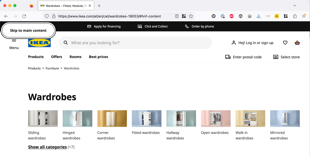
I'll start with ikea.com. The first focusable element on every page is a skip link that allows you to skip the entire header, which makes sense because there are 15 interactive elements in it.
Sidenote: I'm not sure why they set role="button" on the skip link because it's just an anchor link, and there doesn't seem to be any JavaScript involved.
<a href="#hnf-content" role="button" class="hnf-skip-to-content hnf-btn hnf-btn--secondary">
  <span class="hnf-btn__inner">
    <span class="hnf-btn__label">Skip to main content</span>
  </span>
</a>Update 13.10.23: The button role is gone now. Hours after I published this post, someone from the IKEA frontend team contacted me to tell me why they believed it was there. The next day, another person informed me that they'd removed it. Skål! 🔥
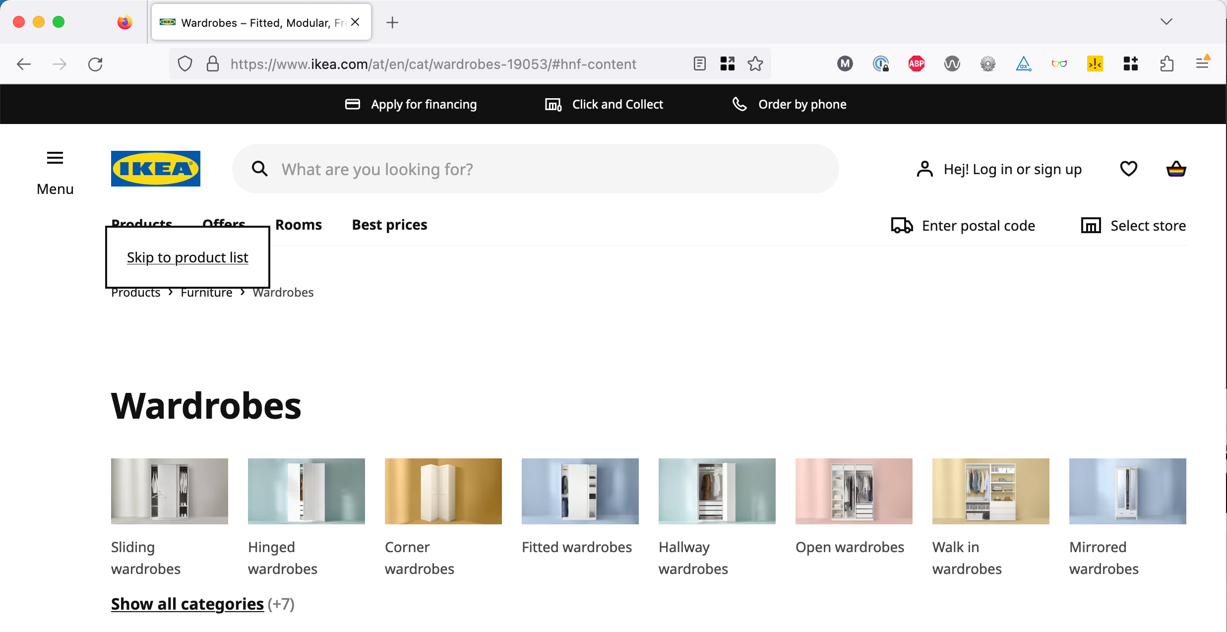
There's another skip link right after the header, which allows you to skip anything between the header and the products list. In this case, that's 11 more interactive elements.
<a href="#product-list-skip" class="plp-skip-to-product-list">
  Skip to product list
</a>Both skip links are super helpful because people who rely on keyboard accessibility only have to press Tab twice instead of 26 times.

