Can web components help improve accessibility?
posted on
Yes!
If there's one thing I've learned in the past year, it's that Shadow DOM isn't the unique selling point (USP) of web components. It's just one part of it that can be useful. How I use web components depends on the requirements for the specific problem I'm trying to solve. Sometimes, I use Shadow DOM exclusively. Sometimes, I use it for progressive enhancement. Sometimes, I don't use it at all.
With this approach and enough planning, web components can encourage an accessibility-first development mindset.
Enforcing best practices
Web components can help you enforce best practices. For example, when it comes to DOM order.
Improving a card component
In the following card component, you pass an image, heading, and text to the shadow tree. Each element goes into a dedicated named slot.
The order of elements in the DOM seems inspired by its typical visual presentation: image first, followed by heading and text. Starting with the heading would be better because headings introduce users to new sections or subsections. It doesn't make sense that the image comes before the heading that introduces it.
<the-card>
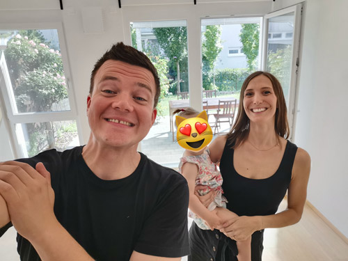
  <img slot="media" src="image.jpg" width="436" height="245" loading="lazy" alt="First selfie of me, my fiance and our daughter in our new home">
  <h2 slot="heading">Goodbye 2022</h2>
  <div slot="content">
    <p>In early 2022, we were looking for a house or flat in Graz, the second largest city in Austria. In June we found a nice place, said “Yes” with no hesitation, and moved in in August. Everything went so quick and now we’re already 5 months here. I like it here. It’s much smaller and calmer than Vienna, but nice.</p>

    <a href="#">Read A year in review: 2022</a>
  </div>
</the-card>
The great thing with named slots is that you can decide where to put each slot.
class TheCard extends HTMLElement {
  constructor() {
    super();
    this.shadow = this.attachShadow({ mode: "open" });


    this.shadow.innerHTML=`
      <slot name="heading"></slot>
      <slot name="media"></slot>
      <slot name="content"></slot>
    `;
  }
}

customElements.define("the-card", TheCard);
When the card is defined, you get the order you prefer.

<h2 heading">Goodbye 2022
In early 2022, we were looking for a house or flat in Graz, the second largest city in Austria. In June we found a nice place, said “Yes” with no hesitation, and moved in in August. Everything went so quick and now we’re already 5 months here. I like it here. It’s much smaller and calmer than Vienna, but nice.
In CSS, you can change the visual order.
the-card {
  max-width: 25rem;
  display: grid;
  border: 1px solid;
  grid-template-columns: 1rem 1fr 1rem;
}

the-card [slot="media"] {
  grid-column: 1 / -1;
  order: -1;
}

the-card :is([slot="heading"],[slot="content"]) {
  grid-column: 2 / -2;
}
Goodbye 2022
In early 2022, we were looking for a house or flat in Graz, the second largest city in Austria. In June we found a nice place, said “Yes” with no hesitation, and moved in in August. Everything went so quick and now we’re already 5 months here. I like it here. It’s much smaller and calmer than Vienna, but nice.
If the developer who uses your component doesn't know the importance of proper DOM order, you can compensate for their lack of knowledge. Pretty cool!
Improving a map
Here's another example: In an map component (or any other iframe), you could enforce the definition of an accessible name.
class TheMap extends HTMLElement {
static observedAttributes = ["title"];
constructor() {
super();
this.attachShadow({ mode: "open" });
let template = `
<iframe title="${this.title}" width="300" height="200" src="https://www.openstreetmap.org/export/embed.html?bbox=16.410889327526096%2C48.18651845664379%2C16.41479462385178%2C48.1885659618031&layer=mapnik&marker=48.18754311355541%2C16.412841975688934"></iframe>
`
if (!this.title) {
template = 'Please provide a title for this map.'
}
this.shadowRoot.innerHTML = template
}
}
customElements.define("the-map", TheMap);Without the title, you get an error.
With a title, you get a map.
Another feature you could add to the map is an inline skip-link to allow keyboard and screen reader users who don't want to interact with the map to skip it.
Progressive enhancement at its core
Web components have progressive enhancement baked in. Let's use a simple disclosure widget as an example: With JavaScript enabled, you get a button that you can click to show and hide the content you slotted. When JavaScript is disabled, you still get the slotted content, only without the button.
Lorem ipsum details…
Lorem ipsum details…
<the-disclosure>
  <p>Lorem ipsum details…</p>
</the-disclosure>

<template id="disclosure">
  <button aria-expanded="false">Details</button>
  <div class="content" hidden>
    <slot></slot>
  </div>
</template>
class TheDisclosure extends HTMLElement {
constructor() {
super();
this.attachShadow({ mode: "open" });
let template = document.getElementById("disclosure");
let templateContent = template.content;
this.shadowRoot.appendChild(templateContent.cloneNode(true));
this._attachStyles();
const button = this.shadowRoot.querySelector('button')
this._expanded = button.getAttribute('aria-expanded');
button.addEventListener('click', this._toggle);
}
_attachStyles() {
const style = document.createElement("style");
style.textContent = `
[aria-expanded="true"] + .content {
display: block;
}
`;
this.shadowRoot.appendChild(style);
}
_toggle() {
this._expanded = !this._expanded
this.setAttribute('aria-expanded', this._expanded);
}
}
customElements.define("the-disclosure", TheDisclosure);