Building a progress-indicating scroll-to-top button in HTML and CSS
posted on
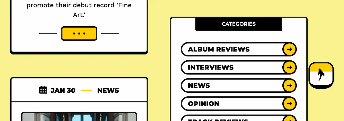
I noticed a nice detail on theneedledrop.com. They have a square scroll-to-top button with an arrow pointing right. The button's border is black, and the background color is white. When you scroll, the arrow points up, and the background color turns gradually yellow as you scroll. That's nothing too special, but it caught my attention because it looks nice and I realized we can build this without JS. Let's try.
I've prepared a simple page with minimal CSS. We first need an ID for the element we want to scroll to.
<main id="content">
  <p>
    …
  </p>
</main>
Next, we need a link that points to the id.
  …
  </p>
  <a href="#content" class="back-to-top">
    <span>Back to top</span>
    <!-- aria-hidden="true" to hide the icon from screen readers -->
    <svg width="32" height="32" viewbox=" 0 0 24 24" aria-hidden="true">
      <path d="M5 12h14"/><path d="m12 5 7 7-7 7"/>
    </svg>
  </a>
</main>
Now, we position the button at the bottom right of the page and hide the text in a way that it's still accessible to screen readers.
.back-to-top {
  /* Basic styling */
  background-color: oklch(100% 0 0);
  border: 2px solid currentColor;
  border-radius: 0.5em;
  display: inline-block;
  padding: 0.3em;
  /* Position at the bottom right of the viewport */
  position: fixed;
  inset: auto 2rem 2rem auto;
}

.back-to-top:is(:link, :visited) {
  /* Instead of the link color, use the text color */
  color: currentColor;
  text-decoration: none;
}

.back-to-top span {
  /* Hide text accessibly */
  clip: rect(0 0 0 0);
  clip-path: inset(50%);
  height: 1px;
  overflow: hidden;
  position: absolute;
  white-space: nowrap;
  width: 1px;
}
Okay, here's where it gets interesting. First, we replace the solid background color with a gradient.
.back-to-top {
  --yellow: oklch(85.33% 0.185 92.12);
  --white: oklch(100% 0 0);
  background-image: linear-gradient(var(--yellow), var(--white));
}Since we don't want one color to fade into the other, we add color stops.
.back-to-top {
  background-image: linear-gradient(var(--yellow) 0% 50%, var(--white) 50% 100%);
}I set it so that the first color starts at 0% and stops at 50%, and the second color starts at 50% and ends at 100% so that you can see what it looks like, but of course, we want to set it to 0% and gradually transition to 100%.
I'll put the color stop in a custom property because that's what we want to animate.
.back-to-top {
  background-image: linear-gradient(var(--yellow) 0% var(--progress), var(--white) var(--progress) 100%);
}
Traditionally, animations run on the document timeline. The timer starts at 0 when the page loads, and starts ticking forwards as clock time progresses. Until recently, that was the only animation timeline we had access to. With scroll-driven animations, we get two additional timelines. One of them is connected to the scroll position of a scroll container along a particular axis. To use it, we create an animation as usual, but set the animation-timeline property to scroll();
@keyframes progress {
  0% {
    --progress: 0%;
  }

  100% {
    --progress: 100%;
  }
}

.back-to-top {
  --yellow: oklch(85.33% 0.185 92.12);
  --white: oklch(100% 0 0);

  background-image: linear-gradient(var(--yellow) 0% var(--progress), var(--white) var(--progress) 100%);
  /* ... */
  animation: progress linear;
  animation-timeline: scroll();
}
That looks great, but it doesn't work. The problem is that we're basically trying to animate strings. We must tell the browser first that --progress represents a <length-percentage>.
@property --progress {
  syntax: '<length-percentage>';
  inherits: false;
  initial-value: 0%;
}
And, that's i…no, wait. We forgot to turn the arrow up. We register another custom property and change its value at 2%. We use the property for the rotation of the SVG.
@property --angle {
  syntax: '<angle>';
  inherits: true;
  initial-value: -90deg;
}

@keyframes progress {
  0% {
    --progress: 0%;
    --angle: 0deg;
  }

  2% {
    --angle: -90deg;
  }

  100% {
    --progress: 100%;
  }
}

.back-to-top svg {
  /* … */
  transform: rotate(var(--angle));
}
animation-timeline is currently only supported by Chromium-based browsers and Firefox behind a flag. That doesn't have to bother us because the link still does what it's supposed to do. If you want to, you can use feature detection to show the yellow background color instead of white for browsers that don't support scroll-driven animations.
@supports not (animation-timeline: scroll()) {
  .back-to-top {
    background: var(--yellow);
  }
}
To animate the scrolling, use scroll-behavior: smooth, but wrap it in a prefers-reduced-motion media query to ensure it only applies to users with no preference for reduced motion.
@media(prefers-reduced-motion: no-preference) {
  html {
    scroll-behavior: smooth;
  }
}
Now, that's it. You can see the final demo here. I like how simple this solution is and how it doesn't rely on JavaScript. Yeah, CSS! ❤️