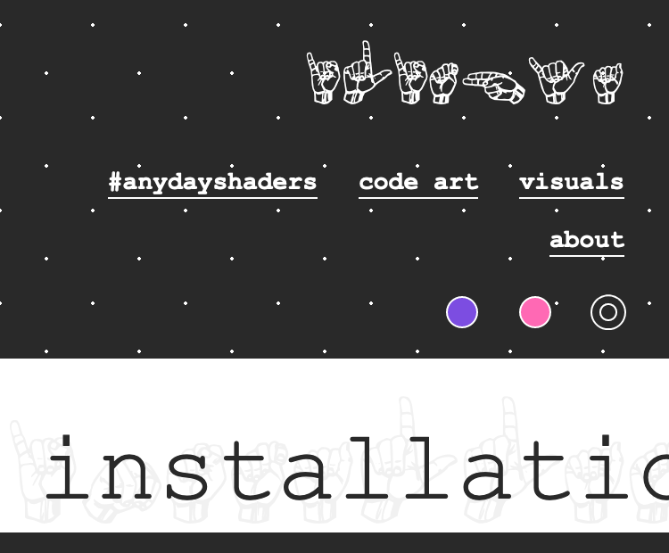
More or less burger-less navigation

posted on

For your and my inspiration: A collection of websites that don’t hide the navigation on mobile behind a burger/menu button.

Show some, hide the rest

bcc.com shows as many links as fit into one row and hides the rest behind a “more” button

Single row, centered

numl.design has a centered logo at the top and a single row with three links below.

Single row, space-between

codersblock.com has a centered logo at the top and a single row with four links below with items split evenly.


hiddedevries.nl has a left aligned logo at the top and a single row with five links below with items split evenly.

Single row, scrollable

There are 6 links in the navigation on flickr profile pages displayed in a single scrollable row. They use gradients to indicate that the row is scrollable.

Multiple rows

“Women for women” has a top bar with a link and a search, below a centered logo and below the logo two rows with three links and a button.


DF Kayes site has link to the homepage on the left and three rows with 6 links on the right.

Vertical navigation

“A “Style Stage” theme. The navgation is rotated 90 degrees and positioned on the right side of the viewport

Single row, additional icons

draufsicht.com decreases the font size significantly, but adds icons to each link on mobile.

Multiple rows, aligned to the right

The navigation on ilithya.rocks is aligned to the right and splits items into 1-2 rows depending on the viewport width